An article last week in the Financial Times alarmed me (
Seven charts that show how the developed world is losing its edge – it’s behind a paywall). The article was by Martin Wolf, the FT chief economics commentator, who is a widely-respected economist and (in my view) a “must-read” columnist. Here is what Wolf wrote that alarmed me, along with one of his seven charts.
"The collapse in the price of semiconductors is the driving force behind the revolution in communications and data processing. The relative price of information processing, measured in this way, has declined by almost 96 per cent since 1970. The slope of the line on the logarithmic scale shows the rate of relative price decline — this slowed drastically after 2010." 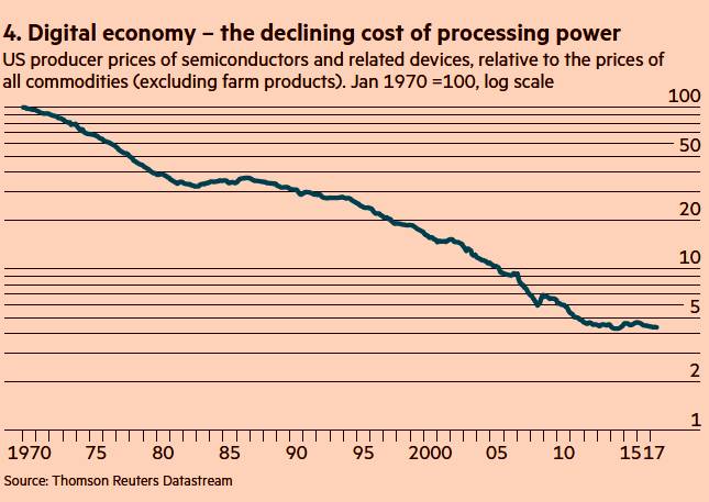
Did this mean that Moore’s Law has been losing its power over tech markets? It better not, or many of the assumptions that are baked in to ARC forecasts (including the Industrial IoT) are false. So, Wolf made me worry and I decided to dig into his chart data to see if that was the cause. My short answer is NO. Not disputing Mr. Wolf’s underlying data, Moore’s Law has very, very little to do with his chart. If that’s enough for you, fine. But if you care to, then let me lead you through my data mining expedition.
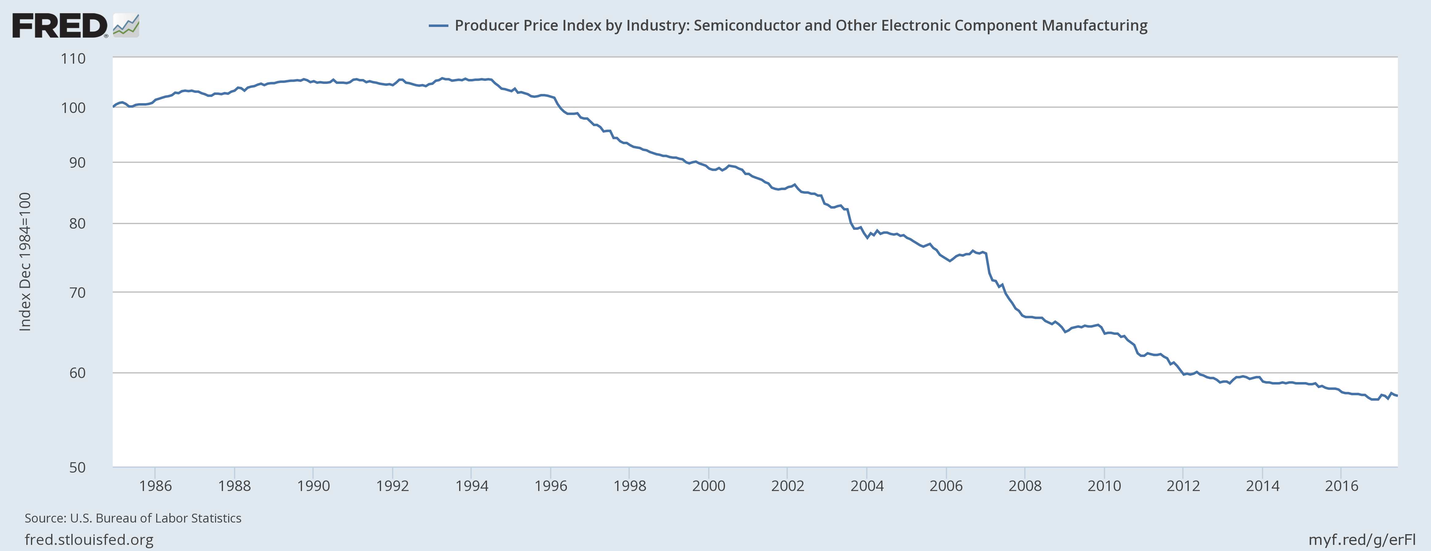
Digging Through the PPI Data Wolf’s chart is of the Producer Price Index (PPI) for semiconductors and related devices relative to the prices index of all other commodities. My first step was to look at just the PPI for semiconductors, which is available from the US Federal Reserve
here. This chart looked very much like Wolf’s chart, so I was still worried. The next obvious question is what products constitute this part of the PPI? These are harder questions to find answers for.
The US Bureau of Labor Statistics issues a monthly report explaining the PPI. All the categories and components that contribute to the PPI are listed in a table in that report. That table has several thousand entries and is 57 pages long. Really. The table is on page numbers 31-87 of
this report. Wolf’s chart is for just a few line-items among the several thousand that make up the PPI (they are in the middle of page number 64, FYI). But the report still does not say what specific products make up the line items. For that answer you need to see the “Data Collection” section of the technical note at the end of the report (page number 176). The BLS explains:
"PPIs are constructed using selling prices reported by establishments of all sizes, selected by probability sampling, with the probability of selection proportionate to size. Individual items and transaction terms also are chosen by probability proportionate to size…. Price data are provided on a voluntary and confidential basis; only sworn BLS employees are allowed access to individual company price reports. BLS publishes price indexes instead of actual prices." My parse of the above is that the index will include major firms in proportion to their market share and will include the products they ship in proportion to their share of shipment value. So the 1992 data would include plenty of Intel 386 processors while the recent data has plenty of quad-core Xeons. The economic concept of a “constant market basket of goods” is problematic in this segment and that is a big problem for these long-term charts and models. Besides which, the raw price data is kept secret and therefore is inherently opaque.
So, I stopped worrying about Mr. Wolf’s chart and concluded that Moore’s Law is (to use the words of
Monty Python) "not dead yet". But do read please do read Mr. Wolf, and do look at his other charts. His work is really well worth your time!